21 September 2007

First Digital Drafts.

I've been having a little go at the DVD menus and mocked up a couple of simple jobbies. They are both basically the same just different colour schemes. I started with the black just to create the basic template and then coloured it using a bright orange (similar to the food websites that I have pointed out earlier).

Text is not currently present as I just wanted to see what it would look like. The pages are for the video menu selection on the DVD.


15 September 2007

Road Map 2

Quick post just to throw sketches of the website and DVD plan. Both are designed to be superficially similar so the design can easily be adapted to either format.

Here ya go!


14 September 2007

Big Thoughts, Big Icons!

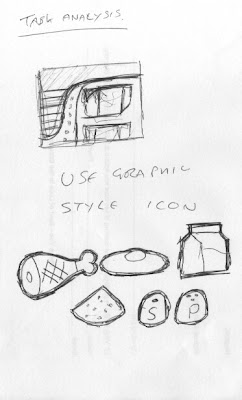
One of the ideas I have is to have a completely icon driven interface, where big bold icons are used to help the user navigate their way around the DVD/website. I've drawn out a few samples but I'm not 100% convinced the idea is a good one just yet. Here are a few of the sketches I've done so far.


UPDATE: After playing around with the idea and talking to the group we've decided it may not be the direction we want to go in.


Conclusion, dropped.

07 September 2007

A New Direction

During our weekly meeting our group, The CAVEmen (Chris, Aleisha, Vinnie and Erin), decided, much like all the other groups have, to focus our efforts onto an interactive DVD instead. This isn't to say that the interactive website is dead, just that it will take a different form and take its cues from the DVD menus instead.

Work does seem to progressing slowly at the moment. I feel another project we are working on for The Seriously Good Chocolate Company is monopolizing our time somewhat. Hopefully soon that will be finished and we can get ont track with this project again.

02 September 2007

New Look

No, not the title of a bad magazine but what has happened to this blog. After looking at various websites dedicated to the fine ninja assassin skill of cooking I have decided to give the blog a similar feel. You may remember on your last visit here the website was aligned with the forces of darkness and was mainly black. Now, if you can't tell, it;s white and much cleaner! The ability to add colours was limited to say the least but I think It looks ok, for a blog!

01 September 2007

Overview

Here are a few of my notes regarding the kitchen project and what it entails.

The website will give students the ability to learn visually and at their own pace. The website needs to contain:

1. Contents
  • course descriptor
  • sample area (for non students)
  • Login
2. Media
  • PDF's
  • video
3. Contact us
  • email
  • forum (where students who have graduated can still go and interact along with current students)
  • memos
  • possible cell phobe interaction